
oCMS v0.30.0 embeds two themes in its prebuilt binary. These previews show the same disposable sample content on desktop and mobile. Open an image to inspect the full screenshot.
-
Default
A light, minimal layout for general publishing, with a card grid and an optional sidebar.
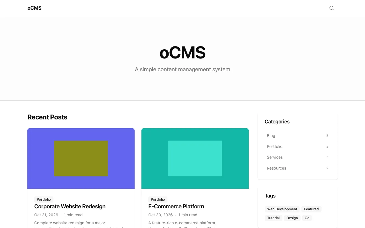
Desktop · 1280 × 800 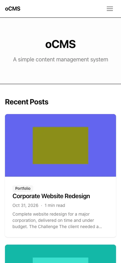
Mobile · 390 × 844 Settings: primary color, favicon and sidebar visibility. View the versioned Default theme.
-
Developer
A dark layout for technical writing, with a green accent and a prominent introduction above recent posts.
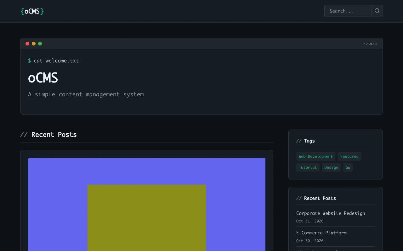
Desktop · 1280 × 800 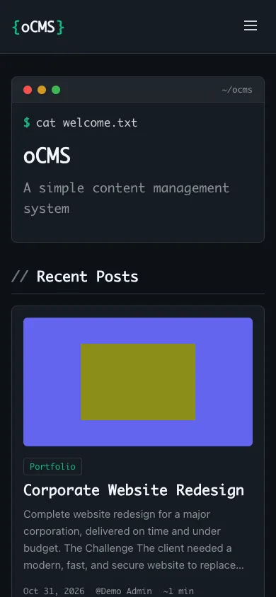
Mobile · 390 × 844 Settings: accent color, code theme, line numbers and hero content. View the versioned Developer theme.
Activate a bundled theme
On your own site, use Admin → Themes to preview and activate a theme. An explicit OCMS_ACTIVE_THEME environment setting takes precedence over the admin selection when the server starts.
To select Default at startup, set this line in your site's .env and restart the site:
OCMS_ACTIVE_THEME=defaultFor Developer, use:
OCMS_ACTIVE_THEME=developerRemove the explicit override from both the configuration file and any exported service environment if you want the admin selection to persist across restarts. No Go rebuild is needed to switch between these two bundled themes.
Build your own design
The separate Tiny Sample archive is a filesystem-based starting point for editing HTML and CSS. It is not one of the two embedded themes shown above.
Follow the first-site walkthrough to download and customize Tiny Sample, or use the theme system guide for template structure, settings and widget areas. A custom theme with the same name can override an embedded theme. Back up your site and custom files before replacing them.